все гайды
Как сделать навигационное меню с анимацией используя html и css?
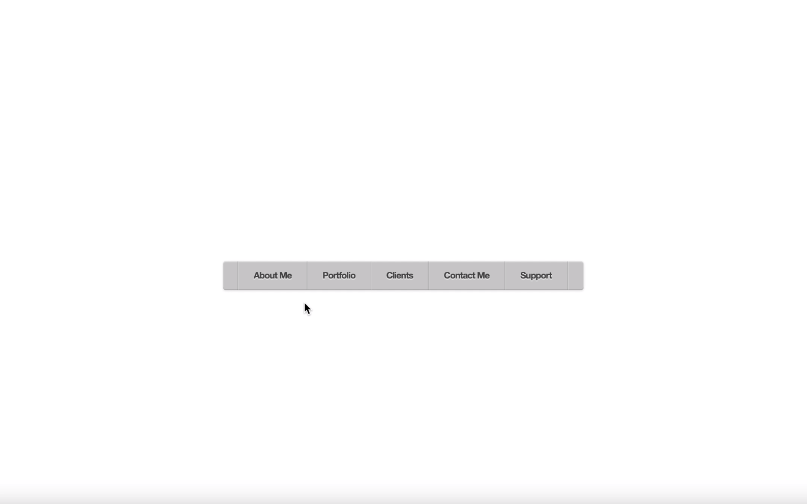
Задача
Рассмотрим составляющие для реализации навигационного меню с использованием анимаций на css и html. В первую очеред определим "скелет" нашей структуры пунктов меню в html, которая имеет 2 уровня вложенности. На css пропишем стили для внешнего вида меню и определим анимацию с помощью свойства keyframe.
HTML
<!doctype html>
<html lang="en">
<head>
    <meta charset="UTF-8">
    <meta name="viewport"
          content="width=device-width, user-scalable=no, initial-scale=1.0, maximum-scale=1.0, minimum-scale=1.0">
    <meta http-equiv="X-UA-Compatible" content="ie=edge">
    <title>Document</title>
    <link href="stylePanel.css" rel="stylesheet">
</head>
<body>
<div id="container">
    <ul id="menu">
        <li><a href="#">About Me</a>
            <ul>
                <li><a href="#">Lorem ipsum dolor</a></li>
                <li><a href="#">Maecenas lacinia sem</a></li>
                <li><a href="#">Suspendisse fringilla</a></li>
            </ul>
        </li>
        <li><a href="#">Portfolio</a>
            <ul>
                <li><a href="#">Lorem ipsum dolor</a></li>
                <li><a href="#">Maecenas dignissim fermentum luctus</a></li>
                <li><a href="#">Suspendisse fringilla</a></li>
                <li><a href="#">Lorem ipsum dolor</a></li>
                <li><a href="#">Maecenas lacinia sem</a></li>
                <li><a href="#">Suspendisse fringilla</a></li>
            </ul>
        </li>
        <li><a href="#">Clients</a>
            <ul>
                <li><a href="#">Lorem ipsum dolor</a></li>
                <li><a href="#">Maecenas lacinia sem</a></li>
                <li><a href="#">Suspendisse fringilla</a></li>
            </ul>
        </li>
        <li><a href="#">Contact Me</a>
            <ul>
                <li><a href="#">Lorem ipsum dolor</a></li>
                <li><a href="#">Maecenas dignissim fermentum luctus</a></li>
                <li><a href="#">Suspendisse fringilla</a></li>
            </ul>
        </li>
        <li><a href="#">Support</a></li>
    </ul>
</div>
</body>
</html>
CSS
* {
    margin: 0;
    padding: 0;
    box-sizing: border-box;
}

body {
    padding: 30px;
    font-family: "Helvetica Neue", helvetica, arial;
    background: url('https://subtlepatterns.com/patterns/white_carbonfiber.png');
}

#container {
    height: 100vh;
    width: 100%;
    display: flex;
    justify-content: center;
    align-items: center;
}

#container:after {
    content: "";
    display: block;
    clear: both;
    height: 0;
}

#menu {
    max-width: 479px;
    width: 100%;
    padding: 0 20px;
    border-radius: 3px;
    box-shadow: inset 0 1px 1px rgba(255,255,255,.5), inset 0 -1px 0 rgba(0,0,0,.15), 0 1px 3px rgba(0,0,0,.15);
    background: #ccc;
}

#menu, #menu ul {
    list-style: none;
}

#menu > li {
    float: left;
    position: relative;
    border-right: 1px solid rgba(0,0,0,.1);
    box-shadow: 1px 0 0 rgba(255,255,255,.25);
    perspective: 1000px;

}

#menu > li:first-child {
    border-left: 1px solid rgba(255,255,255,.25);
    box-shadow: -1px 0 0 rgba(0,0,0,.1), 1px 0 0 rgba(255,255,255,.25);
}

#menu a {
    display: block;
    position: relative;
    z-index: 10;
    padding: 13px 20px 13px 20px;
    text-decoration: none;
    color: rgba(75,75,75,1);
    line-height: 1;
    font-weight: 600;
    font-size: 12px;
    letter-spacing: -.05em;
    background: transparent;
    text-shadow: 0 1px 1px rgba(255,255,255,.9);
    transition: all .25s ease-in-out;

}

#menu > li:hover > a {
    background: #333;
    color: rgba(0,223,252,1);
    text-shadow: none;
}

#menu li ul  {
    position: absolute;
    left: 0;
    z-index: 1;
    width: 200px;
    padding: 0;
    opacity: 0;
    visibility: hidden;
    border-bottom-left-radius: 4px;
    border-bottom-right-radius: 4px;
    background: transparent;
    overflow: hidden;
    transform-origin: 50% 0%;
}


#menu li:hover ul {

    padding: 15px 0;
    background: #333;
    opacity: 1;
    visibility: visible;
    box-shadow: 1px 1px 7px rgba(0,0,0,.5);
    animation-name: swingdown;
    animation-duration: 1s;
    animation-timing-function: ease;

}

@keyframes swingdown {
    0% {
        opacity: .99999;
        transform: rotateX(90deg);
    }

    30% {
        transform: rotateX(-25deg) rotateY(5deg);
        animation-timing-function: ease-in-out;
    }

    65% {
        transform: rotateX(25deg) rotateY(-5deg);
        animation-timing-function: ease-in-out;
    }

    100% {
        transform: rotateX(0);
        animation-timing-function: ease-in-out;
    }
}

#menu li li a {
    padding-left: 15px;
    font-weight: 400;
    color: #ddd;
    text-shadow: none;
    border-top: dotted 1px transparent;
    border-bottom: dotted 1px transparent;
    transition: all .15s linear;
}

#menu li li a:hover {
    color: rgba(0,223,252,1);
    border-top: dotted 1px rgba(255,255,255,.15);
    border-bottom: dotted 1px rgba(255,255,255,.15);
    background: rgba(0,223,252,.02);
}