все гайды
Знаете, как сделать такой мерцающий неоновый текст?🤔
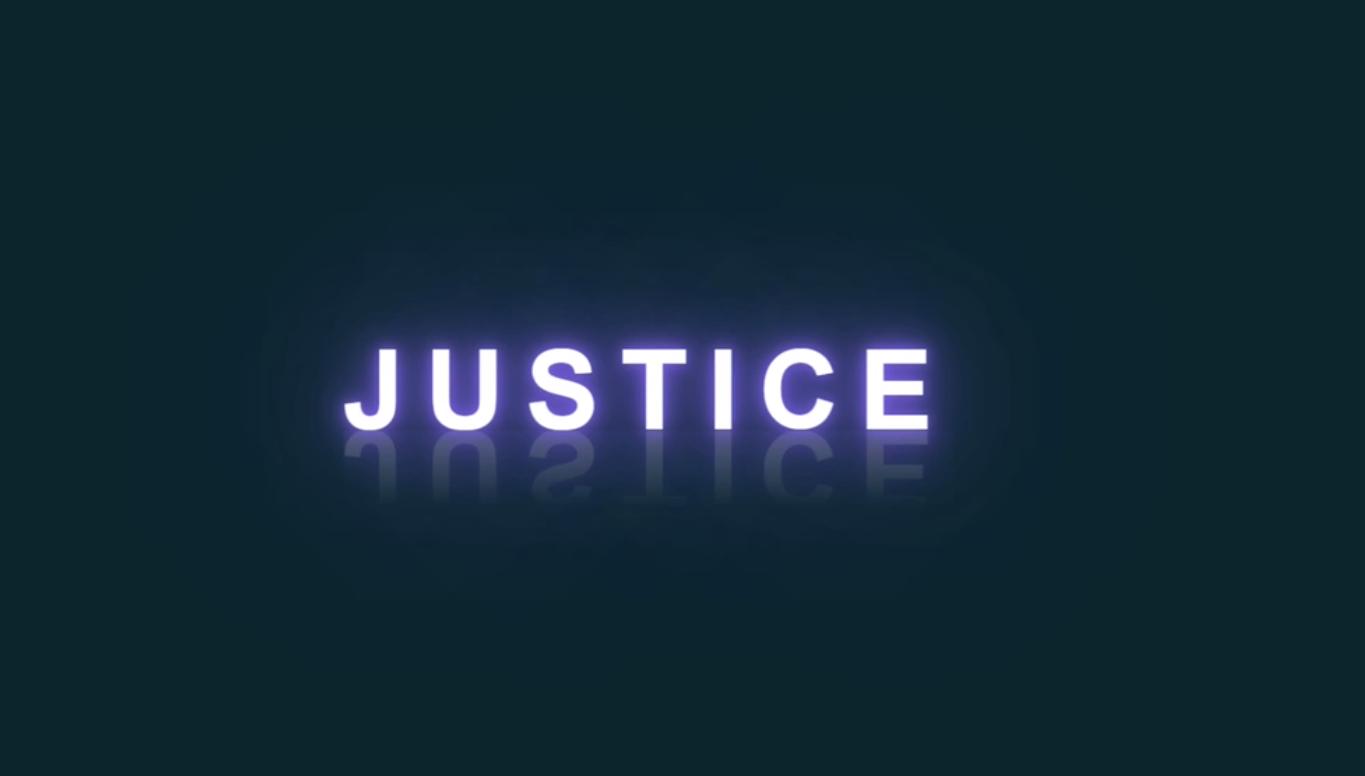
Задача
Давайте рассмотрим этот интересный пример с эффектом неона и отражения на плоскости. Здесь у нас используется строчка html и не большие правила css для придания стиля буквам, но все самое интересное происходит в блоке keyframe, копируйте код и смотрите на красоту.
HTML
<!doctype html>
<html lang="en">
<head>
    <meta charset="UTF-8">
    <meta name="viewport"
          content="width=device-width, user-scalable=no, initial-scale=1.0, maximum-scale=1.0, minimum-scale=1.0">
    <meta http-equiv="X-UA-Compatible" content="ie=edge">
    <link href="styles.css" rel="stylesheet">
    <title>JUSTICE ONE LOVE <3</title>
</head>
<body>
    <h2 contenteditable="true">JUSTICE</h2>
</body>
</html>
CSS
* {
    margin: 0;
    padding: 0;
    box-sizing: border-box;
    font-family: Arial, serif;
}
body {
    display: flex;
    justify-content: center;
    align-items: center;
    min-height: 100vh;
    background: #07252d;
}
h2 {
    position: relative;
    font-size: 5em;
    letter-spacing: 15px;
    color: #0e3742;
    text-transform: uppercase;
    text-align: center;
    -webkit-box-reflect: below 1px linear-gradient(transparent, #0004);
    line-height: 0.7em;
    outline: none;
    animation: text 4s linear infinite;
}
::selection {
    color: currentColor;
    background-color: #03bcf422;
}
@keyframes text {
    0%,
    18%,
    20%,
    50.1%,
    60%,
    65.1%,
    80%,
    90.1%,
    92% {
        color: #0e3742;
        text-shadow: 0 0 5px #0e3742;
    }
    18.1%,
    20.1%,
    50%,
    60.1%,
    65%,
    80.1%,
    90%,
    92.1%,
    100% {
        color: #ffffff;
        text-shadow: 0 0 10px #7d5fff, 0 0 20px #7158e2, 0 0 40px #7158e2,
        0 0 80px #7158e2, 0 0 160px #7158e2;
    }
}